In the ever-growing sea of data, the ability to extract meaningful insights has become crucial. Data visualization serves as a powerful tool in this endeavor, transforming complex datasets into easily understandable visual representations. However, the effectiveness of data visualization hinges on choosing the right charts and graphs. In this blog, we will dive into the best practices associated with this critical aspect, guiding you through considerations such as data types, chart selection, color and design, interactivity, accessibility, and tools.
Understanding Data Types and Visualization Goals
Before getting into available charts, it is essential to understand the nature of your data and the goals of your visualization. Data can be broadly categorized into three types: categorical, numerical, and time-series. Categorical data represents categories or groups, numerical data involves measurable quantities, and time-series data is ordered chronologically.
Consideration of visualization goals is equally important. If your aim is to compare data sets, bar charts or line charts may be suitable. For distribution, histograms or box plots work well, while pie charts are effective for displaying composition. Let us illustrate this with a Python example using the popular matplotlib library:
python
import matplotlib.pyplot as plt
import numpy as np
# Generate sample data
categories = [‘A’, ‘B’, ‘C’, ‘D’]
values_set1 = [25, 40, 30, 20]
values_set2 = [15, 30, 25, 35]
# Bar chart for comparison
plt.bar(categories, values_set1, label=’Set 1′)
plt.bar(categories, values_set2, label=’Set 2′, alpha=0.5)
plt.xlabel(‘Categories’)
plt.ylabel(‘Values’)
plt.title(‘Comparison of Sets 1 and 2’)
plt.legend()
plt.show()
In this example, a bar chart effectively compares two sets of data (Set 1 and Set 2) across different categories (A, B, C, D).
Common Chart Types and Their Applications
Now that we understand the basics, let us explore some common chart types and their applications.
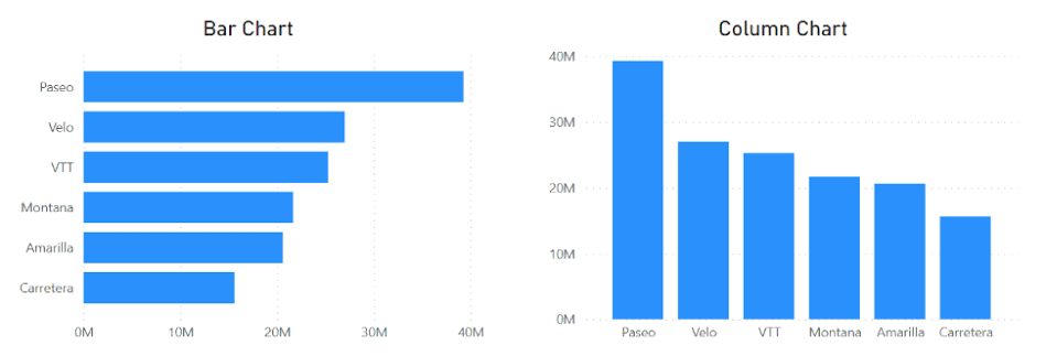
Bar Charts: Ideal for comparing individual groups or categories.
python
# Bar chart for individual group comparison
plt.bar(categories, values_set1, label=’Set 1′)
plt.xlabel(‘Categories’)
plt.ylabel(‘Values’)
plt.title(‘Individual Group Comparison – Set 1’)
plt.legend()
plt.show()
Line Charts: Suitable for visualizing trends over time.
python
Copy code
# Line chart for trend visualization
plt.plot(categories, values_set1, marker=’o’, label=’Set 1′)
plt.xlabel(‘Categories’)
plt.ylabel(‘Values’)
plt.title(‘Trend Visualization – Set 1’)
plt.legend()
plt.show()
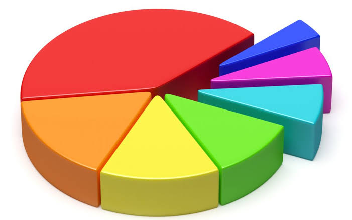
Pie Charts: Effective for displaying the proportion of each category in a whole.
python
# Pie chart for composition
plt.pie(values_set1, labels=categories, autopct=’%1.1f%%’, startangle=90)
plt.title(‘Composition of Set 1’)
plt.show()
These examples demonstrate the versatility of different chart types based on the nature of the data.
Best Practices for Color and Design
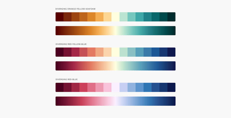
Color plays a significant role in data visualization, aiding in comprehension and emphasizing key points. However, it is crucial to use color thoughtfully.
Color Selection: Choose a color palette that enhances clarity and avoids misinterpretation. The seaborn library provides useful color palettes.
python
import seaborn as sns
# Using seaborn color palette
sns.set_palette(“pastel”)
plt.bar(categories, values_set1, label=’Set 1′)
plt.xlabel(‘Categories’)
plt.ylabel(‘Values’)
plt.title(‘Bar Chart with Seaborn Color Palette’)
plt.legend()
plt.show()
Contrasting Colors: Ensure that colors are distinct, especially in multi-series charts.
python
# Using contrasting colors
plt.bar(categories, values_set1, color=’skyblue’, label=’Set 1′)
plt.bar(categories, values_set2, color=’salmon’, label=’Set 2′, alpha=0.5)
plt.xlabel(‘Categories’)
plt.ylabel(‘Values’)
plt.title(‘Bar Chart with Contrasting Colors’)
plt.legend()
plt.show()
Simplicity and Clarity: Keep the design simple, avoid unnecessary embellishments, and provide clear labels.
python
# Simplifying design
plt.bar(categories, values_set1, color=’skyblue’, label=’Set 1′)
plt.xlabel(‘Categories’)
plt.ylabel(‘Values’)
plt.title(‘Simple Bar Chart – Set 1’)
plt.legend()
plt.show()
These practices contribute to a visually appealing and easily understandable visualization.
Interactive Data Visualization
In today’s data-driven world, interactive visualizations offer a dynamic way to engage with data. Let’s explore how to add interactivity using the plotly library.
python
import plotly.express as px
# Creating an interactive line chart
fig = px.line(x=categories, y=values_set1, labels={‘x’: ‘Categories’, ‘y’: ‘Values’},
title=’Interactive Line Chart – Set 1′)
fig.show()
This example demonstrates a simple interactive line chart. Interactivity allows users to explore data dynamically, enhancing the overall user experience.
Accessibility in Data Visualization
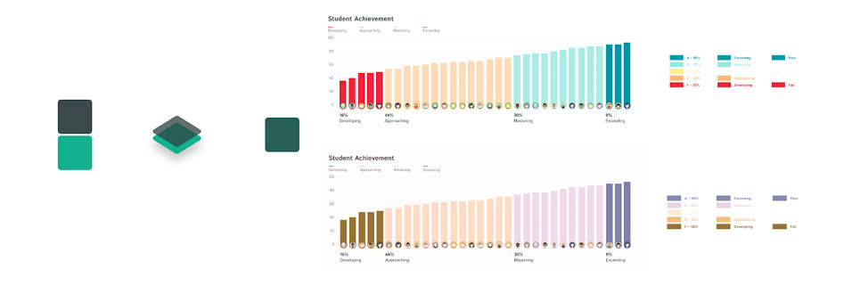
Creating accessible visualizations ensures that everyone, including those with disabilities, can derive value from the presented information.
Colorblind-Friendly Visualizations: Use patterns or labels in addition to colors to convey information.
python
# Creating a colorblind-friendly bar chart
plt.bar(categories, values_set1, hatch=’/’, label=’Set 1′)
plt.xlabel(‘Categories’)
plt.ylabel(‘Values’)
plt.title(‘Colorblind-Friendly Bar Chart – Set 1’)
plt.legend()
plt.show()
Readable Text: Ensure text is legible, and provide alternative text for images.
python
# Improving text readability
plt.bar(categories, values_set1, label=’Set 1′)
plt.xlabel(‘Categories’, fontsize=12)
plt.ylabel(‘Values’, fontsize=12)
plt.title(‘Bar Chart with Improved Text Readability – Set 1’, fontsize=14)
plt.legend()
plt.show()
These practices contribute to making visualizations inclusive and accessible to a wider audience.
Data Visualization Tools and Platforms
Various tools and platforms facilitate the creation of compelling visualizations. Let us compare two popular tools: matplotlib and seaborn.
Matplotlib:
python
# Matplotlib bar chart
plt.bar(categories, values_set1, label=’Set 1′)
plt.xlabel(‘Categories’)
plt.ylabel(‘Values’)
plt.title(‘Matplotlib Bar Chart – Set 1’)
plt.legend()
plt.show()
Seaborn:

python
# Seaborn bar chart
sns.barplot(x=categories, y=values_set1, palette=”pastel”)
plt.xlabel(‘Categories’)
plt.ylabel(‘Values’)
plt.title(‘Seaborn Bar Chart – Set 1’)
plt.show()
While Matplotlib provides a comprehensive foundation, Seaborn simplifies the process with enhanced aesthetics and default styles.
Conclusion
In the world of data visualization, choosing the right charts and graphs is an art and a science. Understanding your data, defining visualization goals, and following best practices in color, design, interactivity, and accessibility are key to creating impactful visualizations. As you explore data visualization and continuously explore new tools, techniques, and emerging best practices to stay at the forefront of this dynamic field. By doing so, you not only enhance your ability to communicate insights effectively but also contribute to the ever-evolving landscape of data visualization.



Add comment