
If you are a front-end developer looking to switch jobs or preparing for your first interview, then you have come to the right place.
Frontend development is a broad topic, and the interviewer can ask you several interview questions. At the foundational level, everything narrows down to HTML and CSS.
In this detailed blog, we will cover some of the most commonly asked HTML and CSS interview questions for freshers and experienced developers. By the end of this blog, you will be able to answer these questions like a seasoned developer.
So let’s get started.
1. What is the CSS Box Model?
One of the fundamental concepts that you should know about CSS is the CSS Box Model. And that makes it one of the most important as well as most asked CSS interview questions.
The CSS Box Model describes how elements are structured and rendered on a webpage. The Box Model consists of four key components: Content, Padding, Border and Margin.
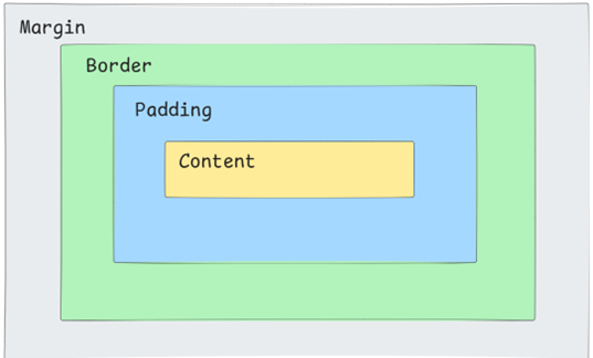
Content
As the name suggests, content is the actual content of the element. It can be text, images or any media elements. The dimension of the content can be adjusted using the width and height properties.
Padding
Padding is the area that is directly around the content. It is the transparent area that differentiates the area between the content and the border of the element. If you set your padding to 50px, it will add 50 pixels of space around all the sides of the content.
Border
Border wraps the content as well as the padding. Borders help you to define the boundary of an element visually. You can control the border of an element by adjusting the values of properties like border, border-width, border-color etc.
Margin
Margin is the outermost layer that separates one element from the other. You can use the property margin to target all the sides or target the individual sides using margin-right, margin-left, margin-top, margin-bottom properties.
One follow-up CSS interview question that can be asked from this is: “What is the alternative to the CSS Box model?”
While most browsers use what we know as the standard box model by default, there is also an alternate box model called border-box. In this model:
The width and height properties include padding and borders within their specified values.
This means if you set an element to have a width of 300 pixels in the border-box model then that total width includes any padding or borders applied.
2. What are the different ways to include CSS in a webpage
This is one of the most straightforward HTML & CSS interview questions. CSS can be added to an HTML document in three ways:
Inline CSS
Inline CSS involves adding CSS directly to HTML elements using the style attribute. Inline styles have become really popular after frameworks like Tailwind CSS started to gain huge traction from the developer community.
Example:
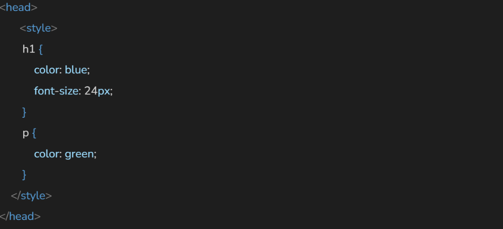
Internal CSS
Internal CSS is similar to inline CSS. Here the difference is that instead of directly applying to elements, the styles are defined within a <style> tag located in the <head> section of the HTML document. This method allows you to apply styles to multiple elements on the same page without repeating code.
Example:
External CSS
External CSS is the widely used method for integrating styles into HTML documents. It involves creating a separate .css file that contains all your style rules and linking it to your HTML document using a <link> tag in the <head> section.

3. What are semantic HTML elements and why are they important
This is another important and most asked HTML interview question. Accessibility is something important, and this question emphasises its importance in modern web development.
HTML5 introduced several new semantic tags that enhance the structure and accessibility of web documents. These elements provide clear context for the tags so that the browser as well as the developer can easily understand the flow of the webpage.
Some of the new semantic tags include:
<article>
The <article> element represents a self-contained piece of content that can stand alone and be distributed independently. It can be blog posts, news articles or any other content that is meaningful on its own.
<section>
As the name suggests, the <section> tag defines a section, which can be a logical grouping of contents within the document. Each section should ideally have a heading, which helps in organizing the content into meaningful parts.
<header>
The <header> tag defines the header of the section or the entire document. It can have a heading, logos or navigation links.
<footer>
The <footer> element contains footer information for its nearest section or article. It can include details like copyright information, contact details, or links to related documents.
<nav>
The <nav> element indicates a section of navigation links. It helps define areas where users can find links to other parts of the website.
4. What are the differences between inline, block, and inline-block elements in HTML & CSS?
This is also one of the important as well as basic CSS interview questions. Each type of element has distinct characteristics that define how it behaves with other elements.
Inline Elements
Inline elements are those that occupy only as much width as their content requires. They do not start on a new line instead they flow within the text and can sit alongside other inline elements. CSS properties like height and width do not affect inline elements. You cannot set these properties to change their dimensions.
Some of the most commonly used inline elements are <span>, <a>, <img> etc.
Block Elements
Block elements take up the full width available in their parent container and always start on a new line. They create a block of content that can contain other block or inline elements. CSS properties for height and width can be applied effectively to block elements. You can set specific dimensions without affecting their display behaviour.
Some of the commonly used block elements are <p> and <div> tags.
Inline-Block Elements
Inline-block elements combine characteristics of both inline and block elements. They allow you to set width and height while still flowing inline with other elements. Unlike inline elements, you can specify both height and width for inline-block elements which allows for more control over their dimensions.
5. What is the difference between position: relative, absolute, fixed, and sticky in CSS?
The position property in CSS is an important property that allows developers to control the layout of elements on a webpage. Each positioning type has its unique behaviour and use cases.
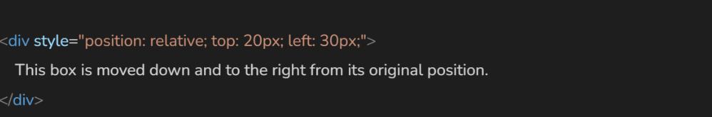
Position: Relative
When an element is set to position: relative, it is positioned relative to its normal position in the document flow. This means that the element will still occupy space in the layout as if it were not moved. You can adjust its position using the top, right, bottom, or left properties.
Example:
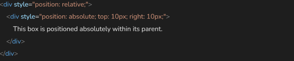
Position: absolute
An element with position: absolute is positioned relative to its nearest positioned ancestor and the ancestor must have a position value other than static. If no such ancestor exists, it is positioned relative to the initial containing block.
Example:
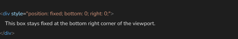
Position: Fixed
An element with position: fixed is positioned relative to the viewport which is the visible area of the browser window. This means that it stays in a fixed position even when the page is scrolled.
Example:
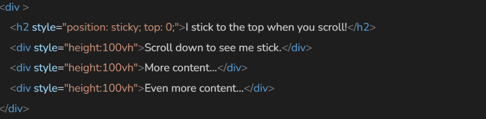
Position: Sticky
The position: sticky property combines aspects of both relative and fixed positioning. An element with sticky positioning behaves like a relatively positioned element until it reaches a specified scroll position at which point it becomes fixed.
Example:
6. What is the purpose of media queries in CSS
CSS is incomplete without media queries, which is why this topic is one of the most commonly asked HTML and CSS interview questions for experienced professionals as well as novice developers. This question can be rephrased in various ways, such as “How do you create responsive websites?” or “How do you design mobile-friendly websites?”
Media queries are a way of creating websites that can adjust their layout according to the device’s dimensions. This allows the end user to access the website regardless of the device they are using, whether it’s a laptop, desktop, mobile phone, or tablet.
Syntax of CSS media queries
The basic syntax for a media query consists of the @media rule. It is followed by a media type and one or more media features.
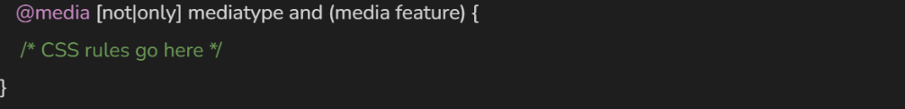
- media type: Here the media type specifies the type of media for which the styles are intended (e.g., screen, print). If it is omitted, it defaults to all.
- media feature: These are conditions that must be met for the styles to apply, such as max-width, min-width, orientation, etc.
7. What are pseudo-classes and pseudo-elements in CSS
One of the popular CSS interview questions for experienced professionals is about pseudo-classes and pseudo-elements. These keywords are used to style elements based on user interaction or specific parts of an element.
A pseudo-class is a keyword added to a selector that specifies a special state of the selected elements. It allows you to target an element when a certain condition is met. For example, if we hover over an element and the :hover pseudo-class is triggered, the styles defined in that class will be applied.
Example:
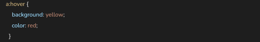
Some of the most commonly used pseudo-classes are :hover, :active, :focus etc.
A pseudo-element is another keyword added to a selector that allows you to style a specific part of an element. Pseudo-elements lets you manipulate content that is not explicitly defined in the HTML markup.
Example:
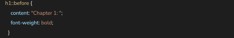
Some of the common pseudo-elements are ::after, ::before, ::first-letter etc.
Conclusion
Thanks for checking out this blog. In this detailed blog, we have discussed some of the most commonly asked HTML and CSS interview questions that you are likely to see during your next job interview.
These key concepts are essential for any front-end developer, as they form the foundation of web development. Also, while learning, don’t forget to implement these concepts so that you have a clear understanding of the topics.
Keep learning!
Also Read:
12 Ways to Make a Great First Impression at an Interview
CSS Frontend 7 CSS Tricks That You Can Use To Grab User Attention
Frontend 7 Surprising CSS Hacks That Will Take Your Design to the Next Level